
For the last two years of my decade-long stint at design consultancy Jkr, I was Senior Designer on the redesign of the Mars brand, part of a £10m European relaunch project.
Chocolate sales were flagging and the Mars Bar was perceived as a hefty calorific slab that you might chomp on occasionally, but often only after a long hike, or hard day's bricklaying. The masculine and dated-looking chocolate brand needed to reinvent itself in order to stay relevant to a younger, healthier audience and to broaden its appeal to women.
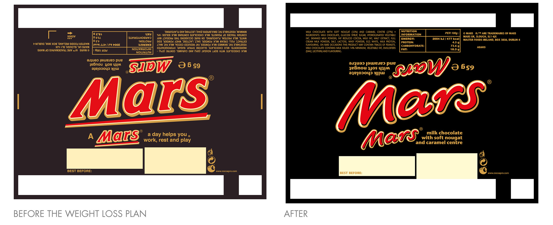
The chocolate bar itself was put on a diet. The reformulated recipe made it tastier, but also lighter and smaller in size. Our job was to redesign the Mars visual identity to reflect this change, without losing the recognition that the much-loved chocolate bar had gained since it's launch in 1932.
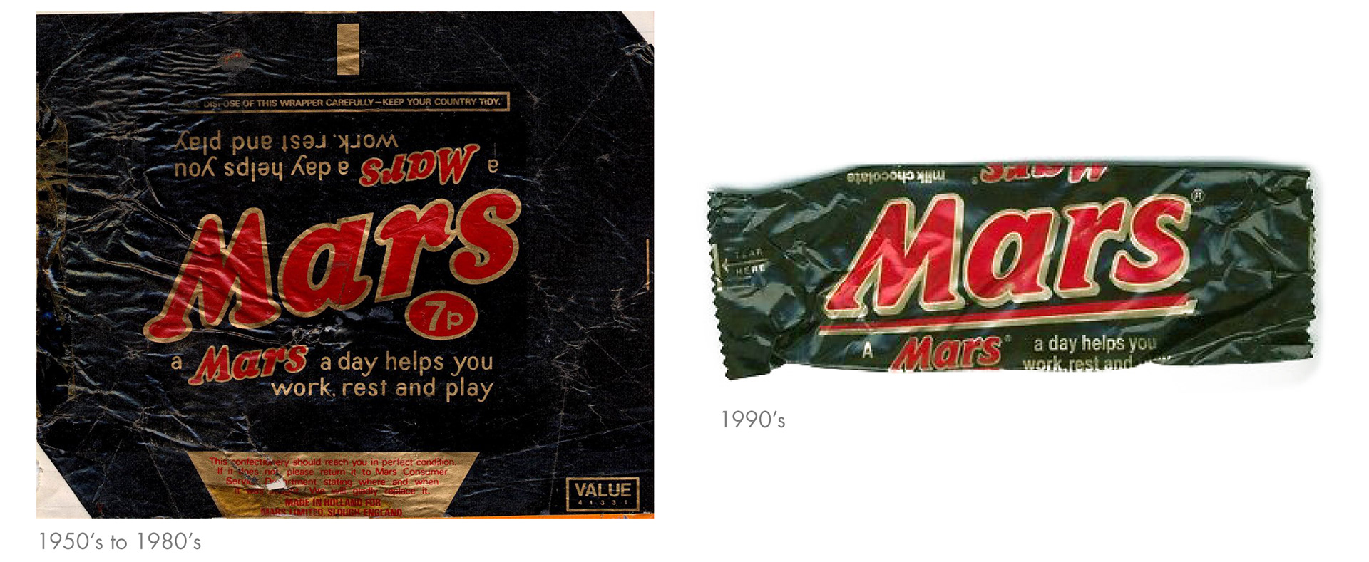
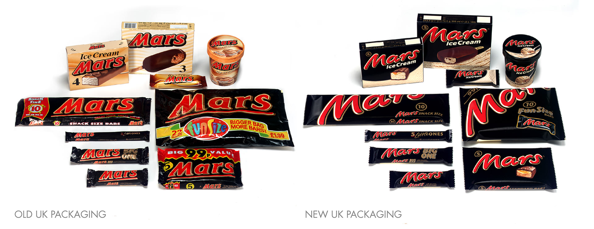
The Mars packaging had barely altered for decades; the distinctive red and gold angled logo on a black pack had existed since the 1950s. The challenge with updating such an established brand is retaining the recognisable visual elements, while at the same time breathing new life into the design.
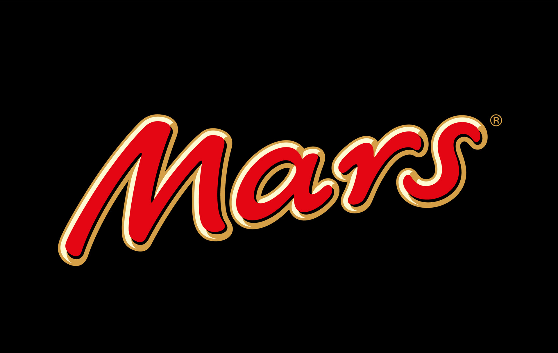
After many stages of design work, a new streamlined logo was developed. It retained the dynamism of the previous logo but in a lighter, less masculine style. The hand drawn script was inspired by the signature of Forrest Mars, the original founder of the Slough based UK brand whose son, Forrest Mars Jr., was still on the board in the US at the time of the redesign.
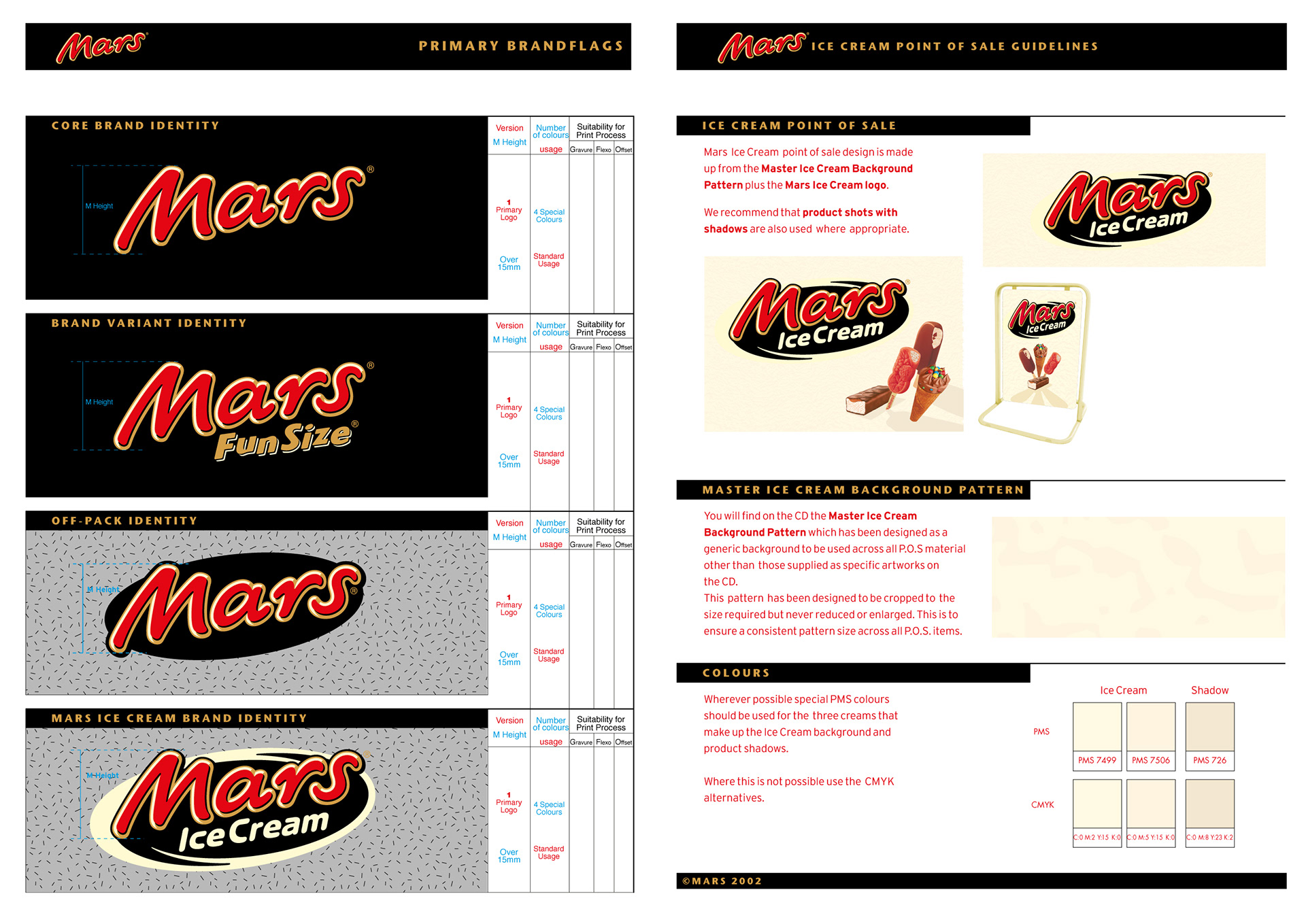
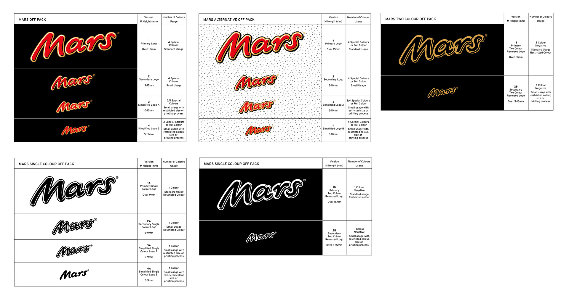
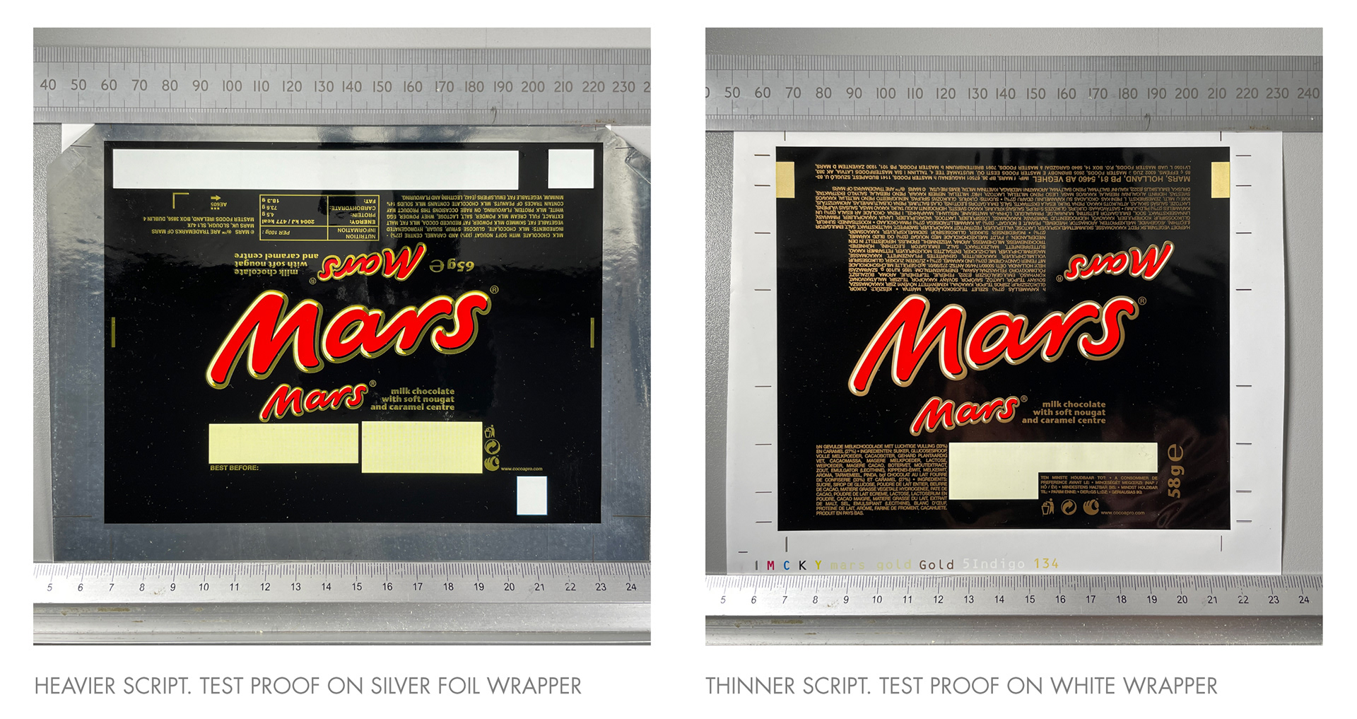
The core brand colours, red, gold and black, were intensified; the cream colour was freshened up and a black dropshadow included within the lettering to give the logo some form and improve standout. The superfluous underline was removed from the pack as was the long-standing 'work, rest and play' strapline which was being updated by the ad agency. New printing inks were formulated to give the colour more depth on pack. But given the scale of the project, all this was a mere 'amuse bouche'...
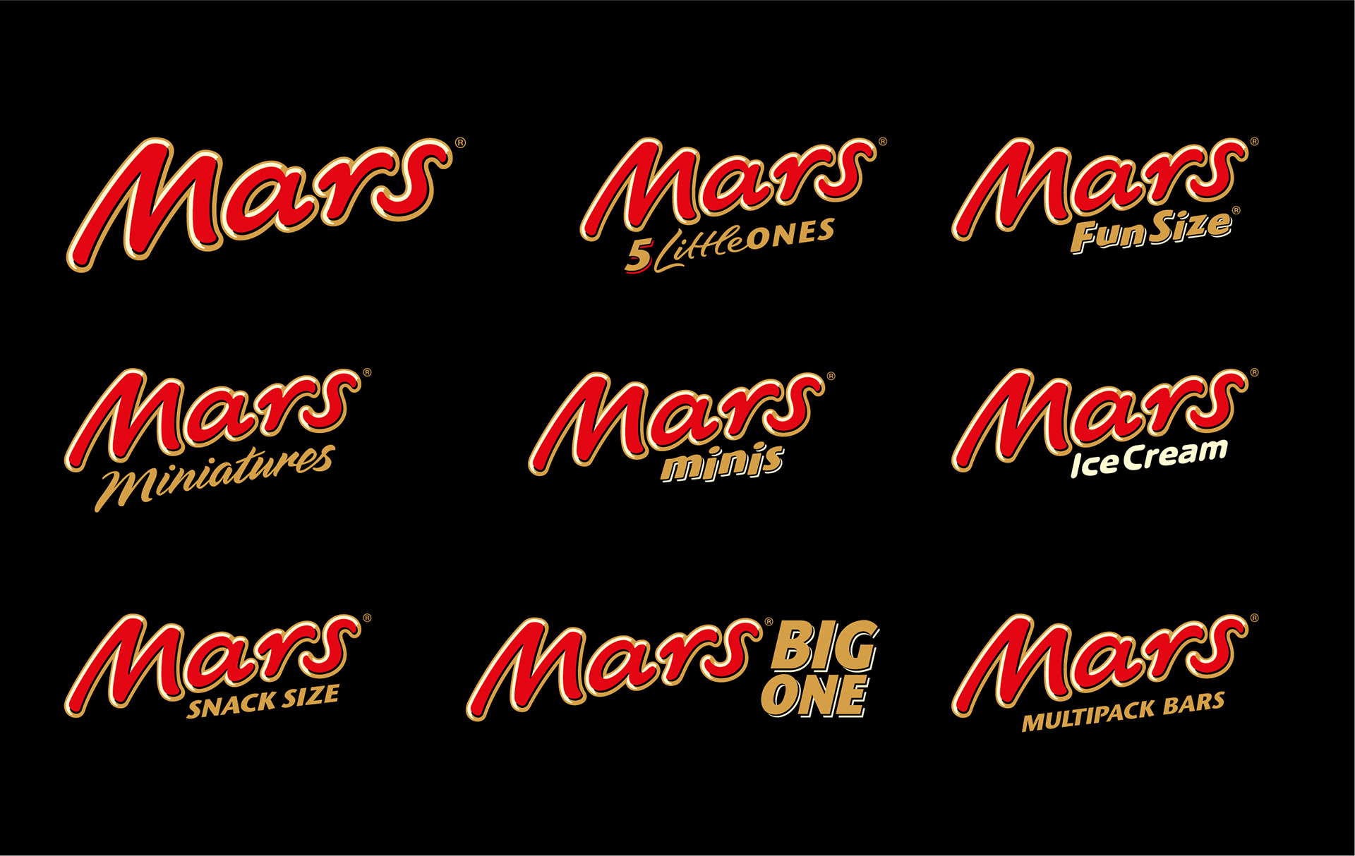
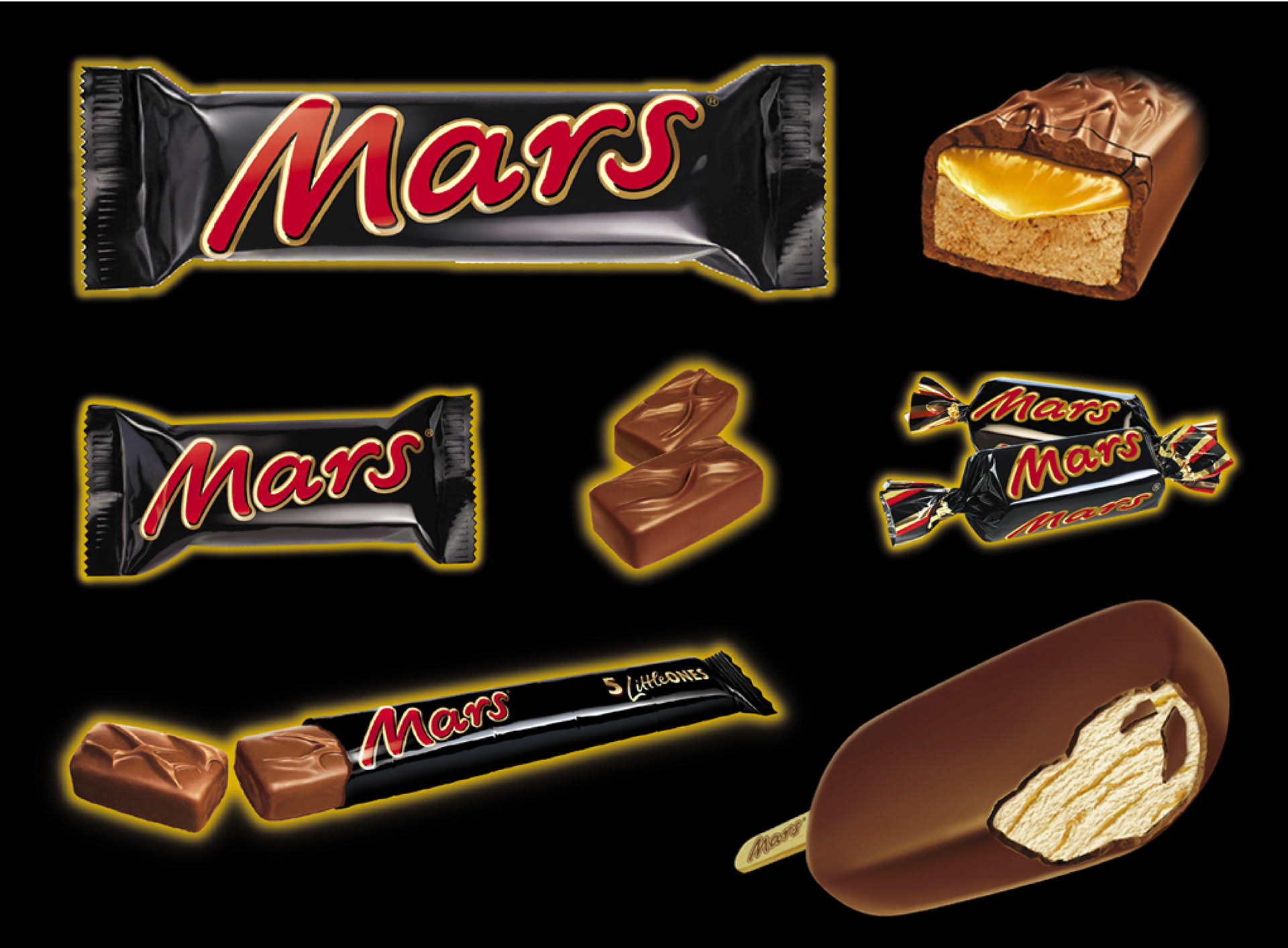
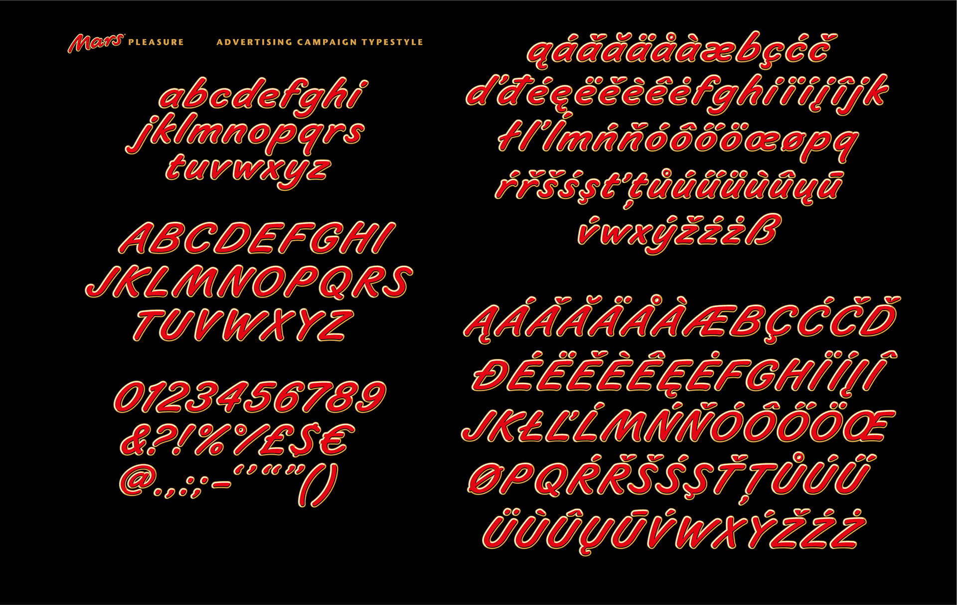
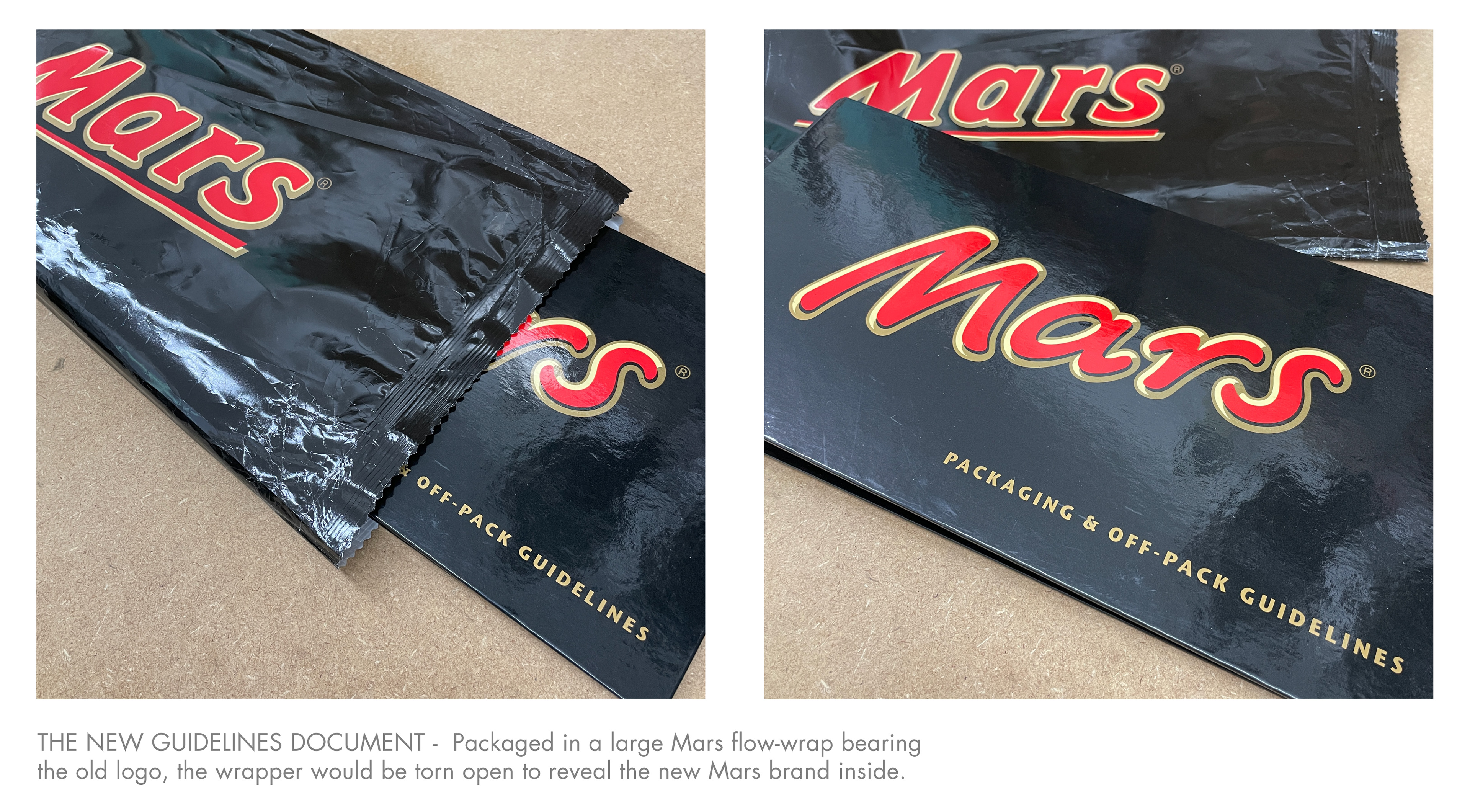
Mars has numerous sub-brands, multiple product types and packaging formats, all of which are sold in most European countries. The new design had to function across all these applications and markets in time for the relaunch, and in conjunction with a major new advertising campaign. That meant we also needed to develop multiple logo variations, secondary typography, product illustrations, structural packaging, a bespoke Mars typeface, detailed packaging guidelines and countless pack artworks. This work took almost two years, many trips to Mars HQ, plenty of chocolate binges and a few minor dental health issues.
However... the logo above isn't quite the design as it was originally intended. The first version that was approved incorporated a continuous flowing stroke between characters 'a' and 'r', making it more signature-like in appearance. Here are two final developments, the version that was initially approved is on the right:
This design was trialled, proofed and applied to multiple packaging artworks ready for the imminent launch. But then, after almost two years' work, we had eleventh hour feedback from the ultimate boss: Forrest Mars Jnr's wife said the new logo wasn't legible enough.
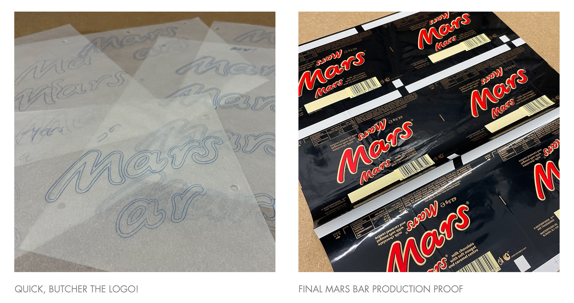
So, I had to swiftly splice the ligature between the 'a' and 'r' as sympathetically as possible, and without it looking like the afterthought it was. I found this painful, like severing my own leg. Well, maybe not. But for a long while I couldn't look at a Mars Bar without tutting and sighing a little. Nevertheless it was great to have accomplished the end result and to have had a key role on such a mammoth project.
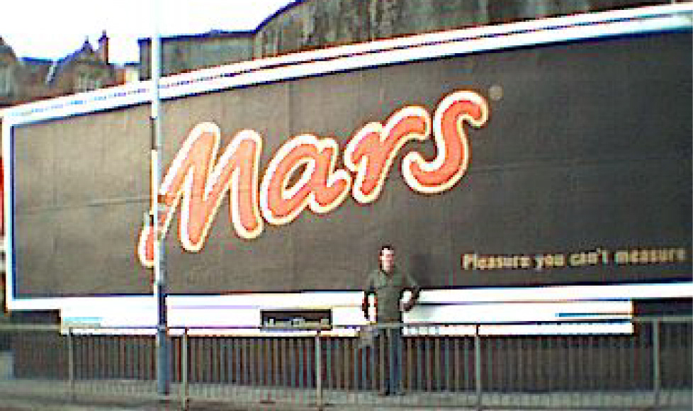
Here's a fresh-faced me, posing proudly in front of a massive version of my newly launched logo in 2002. Unfortunately you can't see how fresh my face is because the picture was taken on a state of the art Blackberry with a 3 megapixel camera.
--------
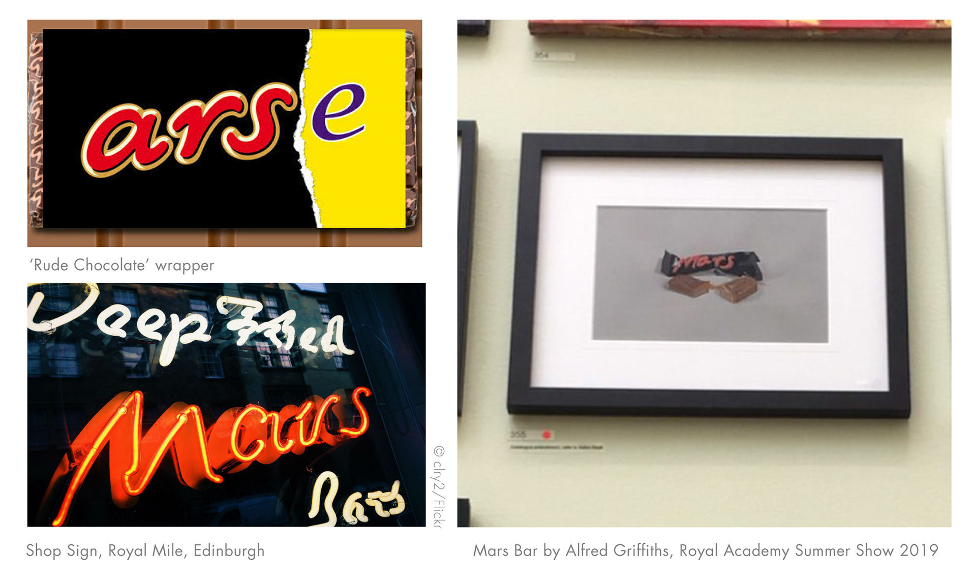
In the world of food and drink products, brand managers change regularly and logos and packaging designs are often updated every few years to keep the brand looking fresh, so the designer's work is usually ephemeral. But the Mars logo has remained the same for the last twenty years, which is a rarity and something I'm proud of. I'll bore anyone who'll listen with tedious anecdotes whenever we see a Mars Bar. And, along with seeing the logo displayed on the chests of Premier League footballers and pitch side hoardings, I also enjoy spotting various hand drawn, mashed up and bastardised interpretations of my handiwork, like these:
The crack team (as far as I can remember) on the Mars rebrand 2000-2002:
Creative Direction - Ian Ritchie
Design Strategy- Chris Halton
Senior Designer - Pete Gibbons
Design Team - Vicky Roberts, Dom Mallin, Robert Brooks, David Mann
Typographer - Alan Levett
Illustrator - Vincent Wakerley
Digital Retouching - Carl Bartram
Structural Team - Paul Stebbens, Ian Smith, Andy Bowyer
Production Team - Troy Davis, Jude Allan, Tina Gibbons, Lisa Stillman, Patrick Lloyd Simon
Account Management - Kate Sanders, Emily Kousah